Design readable loot colors without relying on color alone
Build a visual hierarchy using composited contrast, borders, label size, and redundant signals.
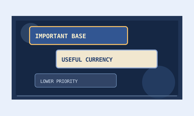
A loot-label palette is an information system, not just a collection of attractive colors. Its job is to make important distinctions easy to recognize while a complicated scene competes for attention. A palette can look excellent on a blank design board and become difficult to read over bright terrain, overlapping effects, or several nearby labels. This article explains a practical method for choosing colors, checking transparency, and adding redundant signals. The objective is readable priorities, not a claim that a browser preview reproduces every player’s experience.
Give each visual decision a job
Begin with the information you want the label to communicate. You might use one treatment for an urgent pickup, another for ordinary resources, and a quieter treatment for optional equipment. Decide which distinctions genuinely matter before choosing colors. If every class has a unique combination of border, text, background, sound, and size, the result can require memorizing a large private language. A small set of consistent treatments is usually easier to maintain and explain.
Separate category identification from priority. For example, a border family can distinguish two categories while font size communicates urgency. That lets you promote one item without redesigning the entire palette. Write a short legend describing the intended meaning of each signal. The legend also makes later review easier: if a new treatment does not fit an existing meaning, decide whether the new distinction is useful or whether it only adds decoration.
Understand which colors actually touch
Text contrast depends primarily on the surface immediately behind the glyphs. A bright border around a dark label does not rescue low-contrast text inside it. Likewise, a label background may separate the text from the world even when the text color alone would disappear against the terrain. Evaluate text against its label background first, then examine how the entire label separates from the ground. These are related but different visual problems.
The Color and Contrast Palette can calculate a contrast ratio for the selected combination. Web contrast thresholds provide a useful reference, but the game’s rendering, label scale, motion, and display settings introduce additional variables. A ratio is not a certificate of in-game accessibility. Treat it as a way to reject weak candidates early, followed by practical checks on the device and viewing distance you actually use.
Composite transparency before judging contrast
An RGBA color includes an alpha channel, so its visible appearance depends on the color underneath it. A partly transparent black label over dark ground differs from the same label over pale ground. If the text is also translucent, its final appearance depends on the already composited label surface. Comparing the raw red, green, and blue values without accounting for alpha can produce a reassuring ratio for a combination that is harder to read in practice.
Test at least a dark ground, a midtone ground, and a bright ground. Keep the label colors fixed while changing the ground so that you can see which component fails. Increasing background opacity may improve stability more effectively than making the text brighter. However, a more opaque label can cover more of the scene. This is a tradeoff to assess deliberately rather than a rule that every background must be fully opaque.
Create a stable neutral baseline
Start with a readable neutral label for the majority of visible drops. A restrained background and clear text reduce the pressure to make ordinary items compete with priority items. Then add emphasis to a small number of categories. If the baseline already uses the largest text, brightest border, loudest sound, and strongest effect, there is little room left to signal anything more important. Hierarchy requires quieter elements as well as prominent ones.
Preview several labels together rather than one label in isolation. The distinction between two treatments matters more than whether each looks pleasing alone. Place your ordinary, optional, and urgent styles side by side. Ask whether you can identify the urgent one quickly without reading its text. Then ask whether the ordinary text remains comfortable to read. A strong hierarchy should not make lower-priority but still visible items illegible.
Do not encode a critical distinction only in hue
Two hues that look distinct to you may be difficult for another player to distinguish. Red and green are a familiar concern, but simply replacing them with another pair is not a universal solution. Perception differs, and low brightness separation can weaken many color pairs. Use a second cue for important distinctions: a different border brightness, a larger label, a supported icon, or a carefully chosen sound. The cue should reinforce the same meaning consistently.
Color-vision simulations can help reveal combinations worth reconsidering, but they are approximations rather than a reproduction of any individual’s sight. Review the original palette and simulated views, and invite direct feedback when possible. Do not claim a palette is safe for every color-vision condition because it looks different in one simulation. The sounds and colors guide develops the broader idea of redundant signals and explains why sound should not be the only fallback.
Use sound selectively and respectfully
A sound can attract attention when a label is obscured, but too many alerts compete with the game and can become tiring. Reserve distinctive alerts for categories that justify an interruption. Keep the mapping stable enough that the sound conveys a useful expectation. If several ordinary categories all produce the same urgent alert, players may stop responding to it. Volume is not a substitute for a clear decision about what deserves attention.
Do not assume that every player has audio enabled or can hear a particular cue. Pair sound with a readable visible treatment. For custom sound files, verify both the instruction and the actual local file in the client environment. The browser cannot confirm arbitrary files in your game directory. A warning that availability is unverified is honest evidence of a boundary, not a claim that the file is missing or that the filter cannot load.
Review size, density, and long labels
Font size affects readability, but making every label large can increase overlap and visual competition. Test representative long names as well as short ones. A compact sample such as a single word may hide problems that appear when a full item name occupies much more space. Consider how borders and backgrounds behave when labels are densely packed. If you solve one readability problem by increasing every label, you may create a new density problem.
Use the Loot Filter Builder to create a small candidate palette, then compare its output with your working file. Document style changes separately from visibility changes. That separation matters because an item that seems to disappear might actually have become difficult to distinguish from its surroundings. A filter comparison helps confirm whether you changed appearance only or also altered conditions and rule order.
Test in a repeatable sequence
First inspect the neutral baseline on several ground swatches. Next compare priority treatments together. Then review simulated color-vision views and remove any critical hue-only distinctions. After exporting, validate the syntax and load the file in the relevant client. Finally observe typical play conditions, including bright areas and visually busy encounters. Keep a short note of failures such as ‘border disappears on pale ground’ rather than a vague judgment that a palette feels wrong.
Revise the smallest relevant component and repeat the same checks. This makes improvements easier to attribute and avoids endless aesthetic tweaking without a usability goal. Save the previous palette before editing, especially if several characters share it. A useful stopping point is a palette whose meaning you can explain, whose ordinary labels remain readable, and whose priority cues still stand out. It need not be visually elaborate to do those jobs well.
Keep the claims narrower than the evidence
Record whether a palette has only been previewed in the browser or also checked in the game. A documentation review is not an in-game test, and a successful test on one display does not represent all displays. If you share the file, include its intended background assumptions and invite users to adjust them. Read the Editorial Policy for how this site distinguishes examples, tool limitations, and verified observations. Clear limits make design advice more useful, not less.