Loot Filter Sounds and Colors: Design a Readable System
Create consistent label roles, understand alpha and contrast, keep alerts useful, and troubleshoot custom sounds without overclaiming browser verification.
Last reviewed: 2026-09-30. Verification note: GGG style and sound documentation reviewed 2026-09-30; rendering and audio not verified in game.
Design signals that help you act
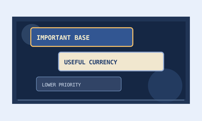
Colors and sounds are useful when they make the next decision clearer. A large bright label with a strong alert should mean something you can explain. If every category uses that treatment, the filter becomes a collection of competing interruptions rather than a prioritization system. Start by defining what each visual and audio cue means to you.
This guide covers label text, backgrounds, borders, alpha, font size, sounds, and supporting markers. It distinguishes documented syntax from the appearance and playback you must verify in the client. GGG’s item-filter reference was reviewed on September 30, 2026. No current game patch, monitor setup, or in-game audio result is certified by that documentation date.
Create a small language of importance
Separate identity from urgency
A category’s identity and its urgency are different messages. A border family can identify equipment you personally inspect, while size or an alert indicates how quickly you should notice it. This lets you retain a stable visual identity even when a category’s priority changes during progression.
Write a brief legend before editing. For example, neutral backgrounds can mean routine inspection, a distinctive border can mean build interest, and a restrained unique sound can mean a progression resource. The exact assignments are yours. Consistency matters more than copying another player’s colors without knowing their meanings.
Reserve the strongest treatment
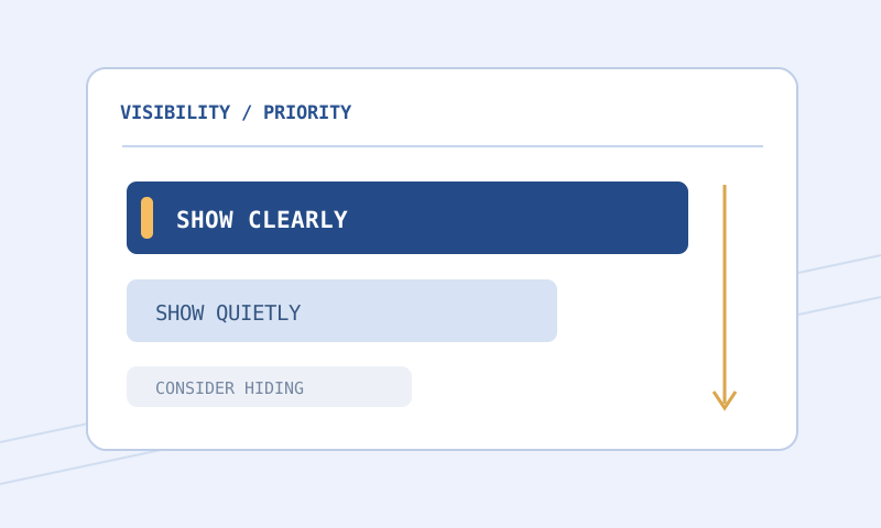
Use maximum emphasis sparingly. A loud alert is valuable partly because it is unusual; repeated routine alerts can train you to ignore all of them. Likewise, making every label enormous can obscure neighboring items and remove the difference between ordinary and exceptional drops.
Review the palette as a group, not as a sequence of attractive individual cards. Two categories that each look excellent alone can become difficult to distinguish when adjacent. A restrained category is doing useful work when it leaves room for a more important signal to stand out.
How filter colors are represented
Documented color actions use red, green, and blue components from zero through 255, with an optional alpha component in the same range. Alpha describes opacity, not a separate brightness scale. A partly transparent color mixes with what is behind it, so its appearance depends on both the stored color and the underlying surface.
The reviewed reference gives background alpha a default of 240 and text and border alpha defaults of 255. Writing alpha explicitly can make intent clearer when sharing or revisiting a style. Mode-specific constraints must still be checked; the reference includes a minimum text alpha for Ruthless. Do not assume every game and mode permits identical stylistic choices.
A readable neutral example
SetTextColor 240 240 240 255
SetBackgroundColor 20 30 45 240
SetBorderColor 100 140 190 255
SetFontSize 32
These lines demonstrate a light text color, mostly opaque dark background, and quieter border. They belong inside a matching filter block and are not a complete filter. Their numerical validity does not prove that they are ideal for your display or activity. Use them as a starting point for measured preview work and client observation.
Style actions do not choose items
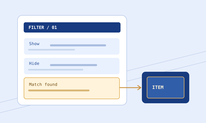
A blue border does not mean currency unless the surrounding conditions actually select the intended currency category. When a color appears on the wrong item, inspect conditions and rule order before changing the color. A label design problem and a matching problem can look similar in a screenshot but require different fixes.
A matching Show or Hide normally terminates evaluation unless Continue applies. Your beautiful style block may be unreachable because an earlier rule already handled the item. With Continue, later matching actions can also matter. Review the complete path rather than assuming the last style in the file always wins.
Use contrast correctly
Account for the ground beneath transparency
Open the Color and Contrast Palette and try multiple ground swatches. If the background is translucent, the visible fill changes as the ground changes. Text alpha can add another compositing step. A ratio calculated only from raw RGB inputs would miss those interactions.
If a label works over dark ground but fails over bright ground, increasing background opacity may be more robust than choosing a new text hue. The goal is a stable readable surface. Very low opacity can make the environment dominate the label, which is attractive in a quiet preview but unreliable during busy play.
Treat a ratio as one diagnostic
WCAG uses contrast targets such as 4.5:1 for ordinary AA text and 3:1 for qualifying large text on the web. These are useful reference points for a palette, not a complete certification of game labels. The game renderer, font shape, motion, effects, overlap, and actual viewing distance all affect readability.
A high ratio does not guarantee good hierarchy. Pure bright text on a very dark fill can be readable yet too visually dominant when used everywhere. Tune contrast for legibility, then tune emphasis across categories. Do not intentionally make important text difficult to read merely to reduce its prominence.
Design beyond color perception
Use the available protanopia, deuteranopia, and tritanopia simulations to identify distinctions that depend too heavily on hue. These are approximate design aids, not medical tests and not exact reproductions of every observer’s vision. Their role is to reveal risky pairs so you can strengthen the message.
Combine color with border brightness, font size, a marker, or a selective sound where appropriate. If two critical categories become nearly identical in a simulation, give them a second distinguishing feature. Avoid making the secondary cue so subtle that it disappears at the scale you actually play.
Check labels at realistic size and distance. Enlarging a screenshot can make fine outlines and small text appear much easier to read than they are during play. Display brightness, scaling, and ambient light also affect perception. The browser preview is a controlled sketch, not the complete environment.
Choose sounds for recognition, not constant alarm
Built-in alerts have documented ranges
The reviewed reference documents built-in alert identifiers from 1 through 16 and volume values from zero through 300, with None available to disable an alert where supported. Use the exact documented instruction form for your game and purpose. A valid maximum volume is not automatically a sensible listening choice.
Test at your normal audio settings and a comfortable volume. Other game sounds can mask an alert that seems obvious in isolation. Conversely, an alert that cuts through everything can become tiring when attached to a common category. Adjust the frequency of alerts as well as their loudness.
Custom sounds are dependencies
A custom sound instruction references an audio asset; it does not embed or supply that asset. Keep the filename, relative path, and actual client-accessible file aligned. Confirm permitted use before distributing somebody else’s recording. An original filter can still create a copyright problem if its accompanying sound pack is not licensed for sharing.
The browser cannot inspect your unrestricted game directory. If the tool has not received a relevant file inventory, availability is unverified rather than confirmed missing. Even a supplied filename match would not prove successful decoding or playback by the current client. Those remain runtime checks.
Keep audio meaning stable
When repurposing a color tier, review its sound too. Otherwise the visual label can indicate a routine pickup while the familiar audio suggests urgency. A stable audio vocabulary reduces the need to look at every alert immediately. Write the intended meaning in your revision notes so that future changes preserve it deliberately.
Use icons and effects as supporting channels
Minimap icons and effects can provide another way to find a drop, but they should support rather than replace readable labels. The reviewed documentation gives MinimapIcon sizes from zero through two, with minus one disabling the icon. PlayEffect uses a defined color list and supports documented options such as Temp and None. Arbitrary CSS color names are not automatically valid filter effect arguments.
Check these features in the client because a browser label preview is not a minimap or particle renderer. An icon’s apparent prominence depends on the actual display context, while an effect can compete with combat visuals. Keep the strongest markers for categories whose meaning remains clear.
A controlled style revision
Change one channel at a time
Begin with readable text and background. Then assign category borders, adjust font size, and finally add audio or effects where they provide a distinct benefit. This sequence makes problems easier to diagnose. Changing every channel alongside strictness leaves too many possible causes when the result feels wrong.
Preserve the selection logic
Use Filter Compare to confirm that a palette revision did not accidentally change Show or Hide headers, conditions, or block order. A style update should not silently become a visibility update. Keep the old file and a note describing the intended visual change.
Validate and observe
Run the edited file through the Filter Validator to catch supported range and shape problems. Use the Item Tester to inspect the matching path for representative samples, recognizing unsupported semantics. Then load the actual revision in the client and observe both a routine category and a highlighted one.
Common problems and fixes
Every label looks equally important
Reduce the number of maximum-emphasis channels. Give routine categories quieter borders and fewer alerts while keeping text readable. Reserve strong combinations of size, sound, and effects for a small set of explicit priorities.
A custom alert is silent
First confirm that the item matches the intended sound-bearing block. Then check file naming, relative paths, local availability, and current client support. A logical match in the browser cannot establish audio playback. Preserve the exact client error if one appears.
The same color looks different in game
Compare opacity, ground, display settings, and the actual selected revision. Browser and game rendering differ. Adjust based on client observation rather than insisting that the preview’s appearance must be reproduced exactly.
A palette works for me but not another player
Vision, displays, viewing conditions, and learned conventions differ. Add redundant cues and invite specific feedback about confusing category pairs. Do not dismiss the problem because a numerical contrast check passed on your preferred swatch.
Frequently asked questions
Can a filter be accessible based on contrast alone?
No. Contrast is one factor. Readability, size, motion, category distinctions, audio dependence, and individual needs also matter. A browser ratio does not certify the full game experience.
Should I use maximum volume for valuable items?
Not automatically. Choose a comfortable, recognizable cue at normal listening settings. Excessive loudness can be unpleasant and does not compensate for attaching the sound to an overly broad category.
Does exporting a sound line include the audio?
No. A referenced custom file remains a separate dependency that must be available to the client. Check licensing before distributing it with your filter.
Why write alpha if defaults exist?
Explicit values document intent and reduce ambiguity during later edits. Defaults are still meaningful, and mode-specific restrictions must be respected.
Can I copy these colors between games?
The numerical style concept may be reusable where supported, but the surrounding blocks and game-specific actions require review. A shared palette does not make entire filters interchangeable.
Were these examples tested on a current patch?
No. The reference was reviewed on September 30, 2026. Exact appearance, file availability, and playback require separate in-game verification.
Related guides and source
Read strictness levels to distinguish hiding from de-emphasis, the installation guide to load your revised style safely, and the PoE 1 or PoE 2 guide for game-specific planning. Consult GGG’s item-filter reference for exact action syntax and supported arguments.